Hello Guest
No Avatar
Sign In to Remove

Show Posts

This section allows you to view all posts made by this member. Note that you can only see posts made in areas you currently have access to.


Messages - Evronn

Pages: [1] 2
Posts: 
24
Posted: May 8, 2011, 11:40 AM
Guests are BKs.
Posts: 
24
Posted: May 3, 2011, 9:51 AM
It may be because of the dark background of this forum, but they all seem a bit washed out.
Posts: 
24
Posted: April 26, 2011, 2:22 AM
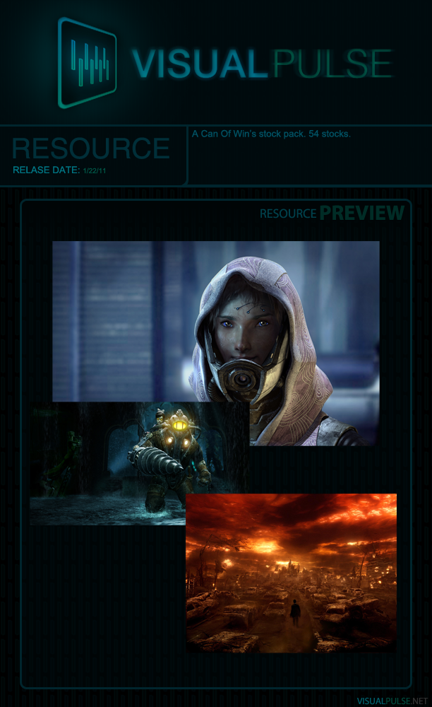
AAAUGH! C4D Spam. The Signature looks great without the top left (kinda blurred) c4d and the shards to the right of him. Something else needs to take its place although i really have no suggestion for that.

Overall great Signature. Text has great placement.

There isn't one C4D in this signature. :o
Posts: 
24
Posted: April 25, 2011, 5:45 AM
It is an overused render, but who cares. It's my first sig in a while.


Posts: 
24
Posted: April 13, 2011, 7:15 AM
I like it, but I feel that the background is too dark for the bubbles (or whatever they are). They seem to almost get lost in the darker blues and greens.
Posts: 
24
Posted: April 12, 2011, 8:00 AM
The effect is quite nice but the line needs to be orange or a darker color.

You should create a whole site design so i can make it  ;D

I could, but I'd need some sort of outline. I have no idea what is needed for a website design.
Posts: 
24
Posted: April 12, 2011, 5:59 AM
I was mainly trying to make the pocket, I think that I did pretty well on this. What do you guys think?

Posts: 
24
Posted: April 10, 2011, 9:36 AM
Great tutorial, thanks.
Posts: 
24
Posted: February 6, 2011, 8:23 AM
Posts: 
24
Posted: February 4, 2011, 7:48 AM
The colors are repeated, try using more colors, some reds, yellows, purples. And the text could be improved. But it's pretty cool, good job.
Posts: 
24
Posted: February 4, 2011, 5:24 AM
Posts: 
24
Posted: February 1, 2011, 7:14 AM
Posts: 
24
Posted: January 31, 2011, 5:53 AM
They both look great, not anything that I could see that needs to be improved.
Posts: 
24
Posted: January 30, 2011, 3:14 PM
It's missing depth and lighting, the C4D is a bit distracting, too.
Posts: 
24
Posted: January 23, 2011, 2:58 AM


Enjoy!
Pages: [1] 2
anything